
Skeive Sjøfolk
Skeive Sjøfolk (Queer at Sea)
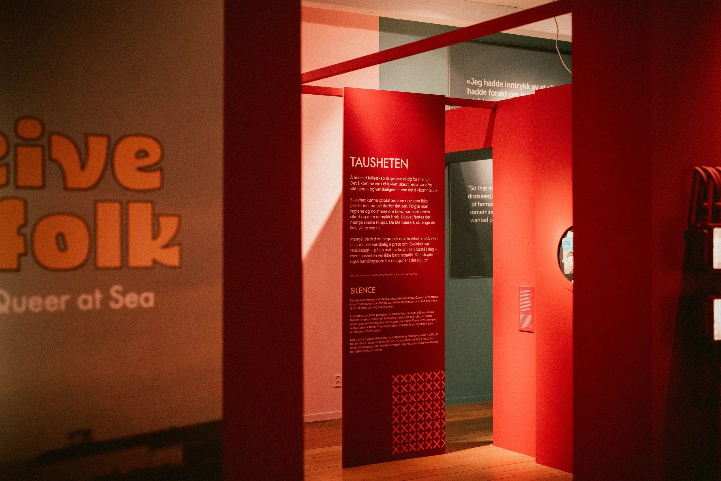
Together with Prestegård Design and the Bergen Maritime Museum, I worked to create a brand identity for the Skeive Sjøfolk—an exhibition sharing the stories of queer people and life on board Norwegian ships in the decades before and after the decriminilisation of homosexuality in Norway.
Colour was a very important part of this project, finding inspiration from the era this exhibition explores as well as from the LGBTQIA+ flag.
The logo typography also draws inspiration from this era, and was custom made for this exhibition.
Client –
Sjøfartsmuseet Bergen
My role –
Art direction, Design
Credits –
This project was a collaboration with interior designers Anne Mette Prestegård and Thomas Sivertsen


